717 798 3495


Are you easily impressed by shiny, new toys?
Most digital marketers are and you can hardly blame them.
Facing mounting pressure to get immediate results from their marketing activities, a lot of digital marketers are often compelled to hop in on the bandwagon of “hot trends” in the quest for effective strategies. Unfortunately, most of these “trends” often turn out to be fads that soon fizzle out.
In the case of web design, jumping on a craze can lead to disastrous consequences for your website usability and conversion rate. Just like with fashion trends, you need to make sure you adopt only the ones that are right for you and your website users so you don’t end up a fashion victim. Below is our review of the latest and biggest web design fads and how they could affect your website’s usability and conversion potential:
1. Rotating Banners Distract Users
Rotating banners (also called sliders, accordions, or carousels) are those giant images that you often encounter on many online retailer sites. They’ve since been so widely adopted by digital marketers and web designers that you can now see them on all types of websites across various industries.
For digital marketers and web designers, rotating banners provide the advantage of website space maximization. It allows several pieces of content to occupy a single, prominent real estate on a web page. In effect, using rotating banners helps convey multiple important messages despite limited web space, like the one below:
 However, conversion and user experience experts agree that the use of rotating banners affect web users negatively. As early as 2011, usability experts have already been criticizing rotating banners as useless and ineffective for the very purpose that marketers and web designers put them on web pages. Apparently, users often scrolled right past banners as they look like advertisements so any info on the banners are missed.
Conversion Conference chair and SiteTuners CEO Tim Ash even condemned rotating banners as “absolutely evil.” According to Tim, motion from rotating banners hogs user attention and distracts them from their main tasks. Tim further slammed rotating banners as symptomatic of the failure of content editorial. Digital marketers and companies should be able to prioritize their most important and essential content instead of throwing everything into the rotating banner to make up for their indecision.
Rotating banners are therefore the perfect example of why you shouldn’t just follow the herd in web design. Just because they’re used by almost everyone doesn’t mean they’re good for your bottom line.
2. Giant Hero Images/Video Backgrounds Confuse Visitors
Having either giant image headers or animated high-quality video backgrounds (also called cinemagraphs) running on continuous loop is an emerging trend in web design. The result is often beautiful and stunning, like this one from Humboldt County:

The use of huge, eye-catching images as website background no doubt capitalizes on the fact that humans are visual creatures. We are not only attracted to images, we also possess rapid visual processing capabilities. Hence, images are a powerful way to capture and maintain the interest of web visitors on a web page.
When combined with motion as in the case of animated video or cinemagraphs, these website backgrounds easily captivate and engage web users. As Tim Ash explains, motion detection is one of our oldest survival instinct: we have 220 degrees of peripheral vision to detect movement.
Giant hero images and animated video backgrounds are therefore double-edged swords for websites. They may be great at creating visitor interest but they also monopolize attention, thereby drawing attention from more important, task-related elements on the page. As the Nielsen Norman Group observes, “large images are visually appealing, but they can harm the overall user experience if they aren’t appropriately prioritized.”
3. Parallax Scrolling Disrupts Navigation
Another web design trend that takes advantage of motion to attract attention is parallax scrolling. Parallax scrolling involves web elements moving at different speeds, thereby creating a 3D effect. Using this technique, web designers are able to achieve an illusion of depth and dynamism on websites, like this one from inTacto:
 In inTacto’s case, you can see how parallax scrolling can be successfully used to make complex concepts more fun and engaging for web users.
But as with video backgrounds and anything that involves movement, you need to learn parallax scrolling sparingly and with great care. Overdoing or misusing the parallax technique poses the risk of overwhelming visitors on your website. A 2015 study by Frederick, et. al. published on the Journal of Usability Studies reveals, for instance, that some users may even suffer from motion sickness due to parallax interaction.
Even more interesting is the fact that the same study shows that web users found no marked differences between non-parallax and parallax websites in terms of enjoyment and visual appeal. So use parallax wisely: do it only if you need to illustrate complicated concepts. Never use it on parts of your site where you want web visitors to focus on navigation elements and complete tasks, such as on an ecommerce websites where visitors rely on web conventions to successfully navigate their way towards conversion.
4. Complex Load Screens Tests User Patience
Remember when Flash-based sites became a hit in the ‘90s to the early 2000s and you had to wait for the entire site to load before you could access a website?
If you think today’s visitors will still sit patiently while your website loads, you better think again. According to Kissmetrics, 47% of consumers expect your web page to load within 2 seconds or they will completely bounce off. That means a lot of lost revenue if your site’s loading speed takes more than 3 seconds.
That’s something to think about before you start adding that edgy new load screen to your website. This brings us back to the use of the parallax technique, which seems to have replaced Flash as this decade’s favored load screen by web designers. You should know that similar to Flash, parallax also has performance trade-offs due to the heavy use of graphics and Javascript.
Of what use will your visually-appealing, cool website be if your visitors won’t stick around to see it anyway?

5. Pop-overs and interstitial messaging annoys users
Pop-overs are literally popping up all over the web these days.
Digital marketers love them since they help get more email addresses and other sorts of information from web visitors. Web visitors, however, often find them annoying. Especially when they appear right when they’re in the middle of doing something on a web page.
But the worst pop-overs are those that appear the moment visitors land on a site, like this one:
 Visitors haven’t even seen the content of the website, they don’t even know yet if they’ll find what they’re looking for, but here an interstitial messaging is already badgering them to give up their email address for a discount.
Pop-overs aren’t bad per se. As with most tools, they only become damaging to usability and conversions when they’re misused or abused. Like when they contain irrelevant offers and interrupt visitors from completing their tasks, or make it difficult for them to find the button to close the pop-over.
Not All That Shines Is Gold
We know how hard it is for digital marketers to resist the pull of the latest web design trends. Most of the time we jump into the bandwagon with good intentions: improving user experience, providing more features for our web visitors, increasing user engagement, and so on.
But if you want your visitors to convert, you need to meet the needs of your web visitors first. So think twice before you implement any new technology or design trend on your website. And make sure that your decision is based on sound data of user intent and the goals for their visit.
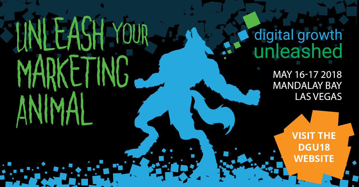
Conversion Conference is evolving into Digital Growth Unleashed! After dozens of shows in the US and Europe since 2010, we are defining a new and more powerful perspective for digital persuasion. Create the most compelling end-to-end customer experiences. Attract, persuade, serve, and the technology to make it happen – we’ve got you covered with four parallel breakout tracks! Plan early and get the absolute lowest rates possible for May 16-17, 2018 at the Mandalay Bay Casino & Resort, Las Vegas.