 717 798 3495


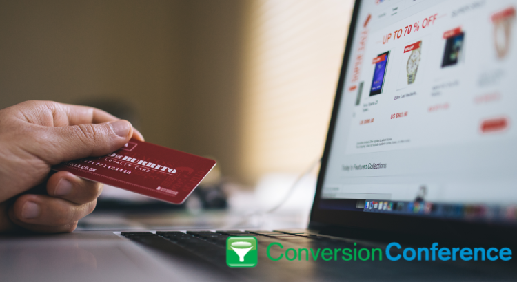
They came.
They added items to their cart.
They left.
If this sounds like your ecommerce visitors, you’re not alone. The average shopping cart abandonment rate is still at 69.23%. Of course, there are a lot of reasons why visitors do not convert at every visit. Some of those reasons are beyond your control, like your visitors’ readiness to buy.
Then there are abandonment factors where ecommerce websites are at fault, like poor ecommerce checkout usability and user experience. So if you want to persuade your visitors to complete their purchase journey with you, you should plug the leaks in your checkout process first.
Here are 7 tips to reduce shopping cart abandonment and increase checkout conversions:
1. Save your visitor’s shopping cart
Nothing is as vexing to customers as a self-emptying shopping cart.
As an online shopper, you might have experienced this yourself. You got distracted so you left the site for a few minutes, only to find out all the contents of your cart has disappeared. This usually happens when you haven’t registered or logged in to the website.
It can be annoying to have to add items back into the cart. A lot of visitors won’t have the patience and just leave. Worse, they’re likely to remember this bad experience and avoid your site in the future.
So save your visitors’ carts even if they’re not registered on your website. Persistent shopping carts are fairly easy to implement with a cookie, and it will keep their cart items even for a week.
2. Don’t force people into registration
Baymard Institute reports that compulsory registration remains one of the biggest barriers to successful ecommerce checkout. It seems a lot of websites haven’t learned their lesson that forced logins lead to high shopping cart abandonment rates.
However, merely offering guest checkout does not absolve your site from bad user experience.
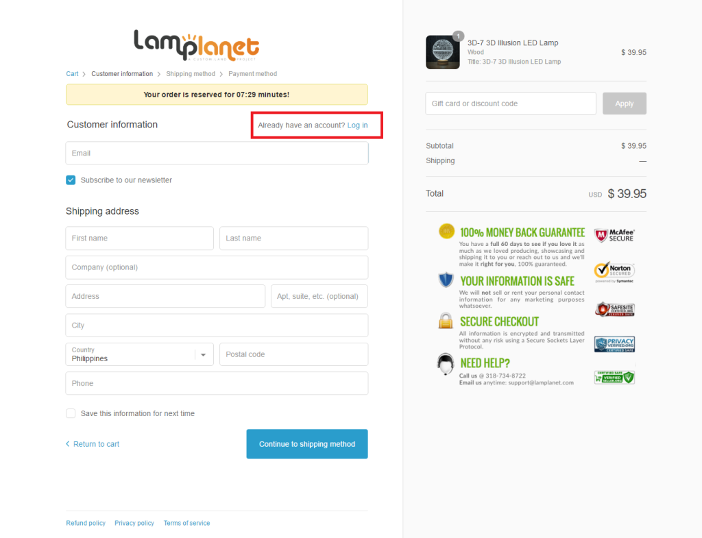
In fact, most sites are guilty of putting a wall right after customers hit the checkout button. Although they may provide the option to check out as a guest, they still interrupt visitors by pressing them to decide to log in or not. Putting the login right after visitors click checkout is completely unnecessary. Instead, why not ask for their shipping address right away, with an option to login at the top so they can do it if they want to? This is how the guys at Lamplanet.com gets it right: After clicking on the checkout button, Lamplanet doesn’t take visitors to the login page but immediately asks them to provide their shipping address. The login page is still accessible as a link at the top.
So when we say make registration optional, don’t just give them the option to checkout as a guest; Remove the friction created by the login page. Let your visitors complete checkout first and register later. Better yet, automatically create an account for them with the information you got from their order, and have them activate it with a password.
3. Make your checkout process easy and transparent
Think about how visitors perceive your checkout process. Is it simple and easy or long and confusing?
When it comes to checkout, your goal is to make it simple for visitors to finish their transaction. Checkout is already painful for visitors (being associated with parting with their cash). You don’t want to add to that. You want to reduce your users’ cognitive load so they can complete their task in no time.
Even simple things like ensuring that the content of their shopping cart is visible throughout checkout help a lot in easing visitors into the purchase. Content visibility is important so visitors don’t have to check back if they forgot what color or size they put into their cart. Always provide an order summary and allow shoppers to review and edit their orders right in the checkout if necessary.
Pre-fill as much information as you can. Manually typing in addresses and choosing shipping options can be tedious for customers. Use tools like free lookup tables to pre-fill the values for a customer’s city, state and country based on the zip code. Have a default shipping option to ease the decision-making for your visitors. Also, allow customers to edit their carts without losing information they’ve already entered such as billing and shipping addresses.
4. Address objections and doubts early
People who buy online don’t have the benefit of seeing, touching, and inspecting the products they want. This could increase their hesitation with completing the transaction, especially if they’re buying from you for the first time.
The next best thing in the absence of the physical product is for help to be readily available when they need more information or assistance to complete their purchase. Anticipate your visitors’ doubts and address their objections by embedding customer service-oriented features in every step of your checkout process. For instance, you can use live chat or a click-to-call feature to answer questions and assist visitors who are having trouble with checking out. You can also provide a link that opens a lightbox with your return or refund policies so visitors remain on the checkout page while reading it.
Make sure helpful features are immediately visible but also that they’re non-intrusive. The live chat feature should be obvious but the message box should appear only when prompted by the visitor. No one likes being incessantly prompted to chat and having to constantly dismiss the chat box on every page of your site.
Provide alternative means of communicating with you if you can’t provide your visitors 24/7 live chat or call support.
5. Be upfront with additional fees
Additional taxes, shipping costs and handling fees are serious deal breakers for online shoppers. In fact, it’s listed as one of the major reasons for shopping cart abandonment
Unexpected fees tend to jack up the total purchase, to the dismay of your prospective customers. Taxes often can’t be avoided (although this is subject to state or country regulations). So if you can afford it, give your visitors free handling and shipping. You can even benefit from the persuasive aspect of free shipping by using it as an incentive for customers to increase their order value. Popular ecommerce stores, for instance, offer free shipping at a certain price threshold.
If free shipping is not an option, then at least minimize the impact of these not-so-delightful surprises by letting visitors know well in advance that there will be additional charges for taxes, shipping, or other fees on their purchase. Don’t wait until visitors are deep into the checkout process; Give visitors the ability to estimate their tax and shipping fees while still in their shopping carts.
6. Alleviate security and payment-related concerns
People are typically cautious of giving out their financial information online. Recent news of security breaches on major ecommerce retailers have made online shoppers more conscious of the risk of identity theft and credit card fraud.
To get your online visitors to complete checkout, your site must be perceived as secure enough. Reassure your visitors that their financial information is protected by putting trust badges in your checkout pages. Putting security seals are especially important on the pages that ask for credit card details as these parts are more likely to raise visitors’ expectations of information safety.
Some shoppers may be reluctant to transact with you even if you pepper your pages with trust and security badges. There will always be customers who are uncomfortable with typing in their credit card details. If you want to convert more of your visitors, then provide multiple payment options. For instance, you can integrate with well-known payment facilities such as Paypal or Amazon 1-click checkout into your website.
By using these well-known payment facilities, you not only reduce visitors’ concerns of online security threats but also minimize the need for shoppers to manually input their card details and even addresses.
7. Remove distractions.
The fact that your online visitors have reached checkout speaks volumes about their motivation.
Although it’s tempting to put more items in front of them to increase order value, sometimes doing so can be counterproductive. So be careful about upselling at checkout. Make sure these are not only relevant but that they don’t interrupt the checkout process.
Remove upsells if you think they distract visitors from their goal of completing the transaction. Remember what your checkout is for: to let visitors finally become customers. Don’t divert them from doing so by trying hard to get more items into their carts.
Conclusion
Not all of those who visit your ecommerce site are ready to buy. Some of them may be browsers who are comparison shopping. Others may be using your shopping cart as a virtual grocery list. But it is in your interest to make the checkout process as easy and hassle-free as possible for those who are intent on completing journey to become your full-pledged customers.
Conversion Conference is evolving into Digital Growth Unleashed! After dozens of shows in the US and Europe since 2010, we are defining a new and more powerful perspective for digital persuasion. Create the most compelling end-to-end customer experiences. Attract, persuade, serve, and the technology to make it happen – we’ve got you covered with four parallel breakout tracks! Plan early and get the absolute lowest rates possible for May 16-17, 2018 at the Mandalay Bay Casino & Resort, Las Vegas.

Thoroughly enjoyed the piece of writing. I found every tip executable in this post. I think hidden costs and long registration process hinders people a lot and because of them they just choose your competition over you. So being upfront about your policies and costs is the best thing you should do to reduce your cart abandonment.