You put a lot of effort into your landing pages. You follow a process to analyze all the pages in your conversion funnel and identify where people drop out, then you run A/B or multivariate tests to improve those pages. And your conversion rates are increasing as a result.
Congratulations!
But what are you doing to reduce buyer’s remorse after the conversion?
Are you giving as much attention to your thank-you page as the rest of the pages in your funnel? If not, keep reading because the thank-you page is one of the most important pages in the conversion process.
Unfortunately, it’s also the most overlooked by webmasters and marketers, which is why so many of them end up looking like this:
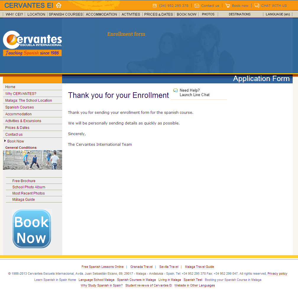
If you have an ecommerce site, don’t think that just because you got the sale, you’re done. After all, people still shop around after buying, and they can certainly cancel their order and get a refund if they find something they like better.
Same goes for lead gen. Even though they filled out your form or talked to your sales rep, it doesn’t mean they’re not also filling out forms on your competitors’ sites and talking to them at the same time.
So how do you reduce the chances of that?
With the perfect thank-you page.
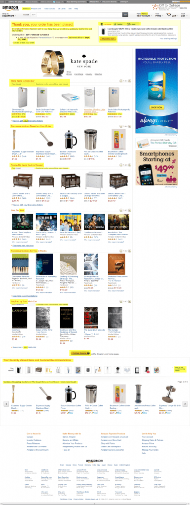
Let’s dissect what makes a perfect e-commerce thank-you page by looking at the master, Amazon:
- First, I am thanked and get confirmation that my order was placed, as well as the reassurance that an email confirmation has been sent.
- I also get confirmation of my delivery date.
- I can review oredit my order, even after it was confirmed (how many businesses are afraid to offer this?).
- Notice important calls-to-action are above the fold: First, I’m invited to share what I just bought via facebook, twitter or email. This obviously isn’t relevant for the majority of products that I buy on Amazon, but even if I do this only once in a while, Amazon is getting fantastic reach with the items I do share. I’m also reminded of the items I recently viewed — and haven’t bought yet, mind you — in case I’m still interested in them.
- Notice how well page is personalized for me: 1) I counted 30 instances of “you,” “your,” or my name. 2) Not only am I reminded of items I’ve viewed in the past (baby mattresses), but I’m also introduced to items related to that search (cribs). 3) Amazon suggests new (and everyone loves new) TV shows for me based on what I’ve watched in the past. 4) Same with books and what’s in my wish list. Because Amazon tracks what I’ve viewed and bought in the past, I’m actually interested in the products they’re offering. This isn’t just a generic list of products related to the coffee grinder I just bought; this is, a list totally personalized for me, based on my previous activities.
- Notice the social proof:Every recommended product has ratings and reviews. I can see what other products customers viewed.
- Notice how they try to re-engage me:It’s clear that the goal of this page is to re-engage me and get me to buy something else or convince someone I know to buy something. This is just one of the reasons why Amazon is the master. It’s a stark contrast from most thank-you pages, that basically tell you to get lost after they’ve gotten what they want from you.
Conversion Conference has evolved into Digital Growth Unleashed!
Create the most compelling end-to-end customer experiences. Attract, persuade, serve, and the technology to make it happen – we’ve got you covered with four parallel breakout tracks! Plan early and get the absolute lowest rates possible for May 16-17, 2018 at the Mandalay Bay Casino & Resort, Las Vegas.
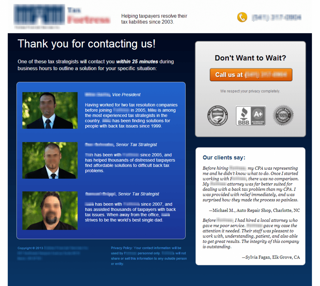
And for lead gen:
- Again, this page below thanks the visitor for their action.
- It tells them what will happen next — and when: “One of these tax strategists will contact you within 25 minutes.” Important: don’t overpromise here. Make sure your sales team can realistically deliver on the timeframe.
- If the visitor decides s/he doesn’t want to wait 25 minutes, s/he is invited to call and speak to someone immediately.
- The company’s credentials are near this call-to-action.
- I love the fact that pictures and short bios of the people who will call back are featured. (A video would be even better.) This accomplishes 2 things: (1) It establishes a human connection beforethe salesperson even calls the prospect, which reduces the chance that the prospect will also fill out a form at a competing firm while waiting for a call back; and (2) It warms the lead for the salesperson and makes the prospect more receptive to talking to him once he calls.
- Notice the social proof with 2 testimonials, which reinforces that this firm has helped other people with similar problems.
Here is a checklist for a good thank-you page:
- Thanks the visitor for converting and confirms that it was completed successfully. It includes the details of the transaction if applicable
- Reinforces why converting was a fabulous idea.
- Tells people what to expect next, and when. It’s specific and only promises what can be delivered, such as a phone call within 10 minutes or an email receipt.
- Has another call-to-action, such as to like/follow the company on social media, share information about the transaction with the visitor’s own network, or to buy something else of interest to the buyer.
- Establishes a human connection.
Just like for the rest of your site, you should define a goal for your thank-you page, then run it through A/B tests.
By putting the same amount of time and effort into your thank-you page as you do on the rest of the pages in your conversion funnel, you can increase sales and reduce the chance that your visitors will also convert on your competitors’ site.
This article first appeared on the ConversionMax Blogrepublished with permission from the author.
About the Author
 Theresa Baiocco is Conversion Strategist at Conversion Max, where she specializes in helping mid-sized businesses increase their online revenues with conversion optimization. She has a Master’s Degree in Marketing from the University of Colorado in Denver, a Master Certification in Conversion Optimization from Market Motive, and is a Google AdWords Qualified Individual.
Theresa contributes guest blog posts to several popular conversion and PPC blogs, such as Unbounce, UserTesting, and 3Q Digital, among others. Her writing has also been included in the Wall Street Journal and is often included in Marketing Day. She’s a dog-lover, a new mom, and a former travel-junkie.

 717 798 3495


