A lot of marketers ask:
How do you get people to take action on your offer?
The answer: design your website and offers based on how their brains operate.
However, most marketers are still targeting the wrong side of the brain – the logical aspect that takes up too much conscious effort and is therefore reserved by the brain for really important decisions.
What marketers should be doing instead is appeal to the part of the brain that’s in-charge 95% of the time: the irrational side. The irrational brain is responsible for visitors’ online behavior: lazy, impatient, and operating on autopilot.
“The brain is the last frontier and we’re just now peeling back all of those cognitive biases and shortcuts that our mind makes.” – Tim Ash, CEO, SiteTuners
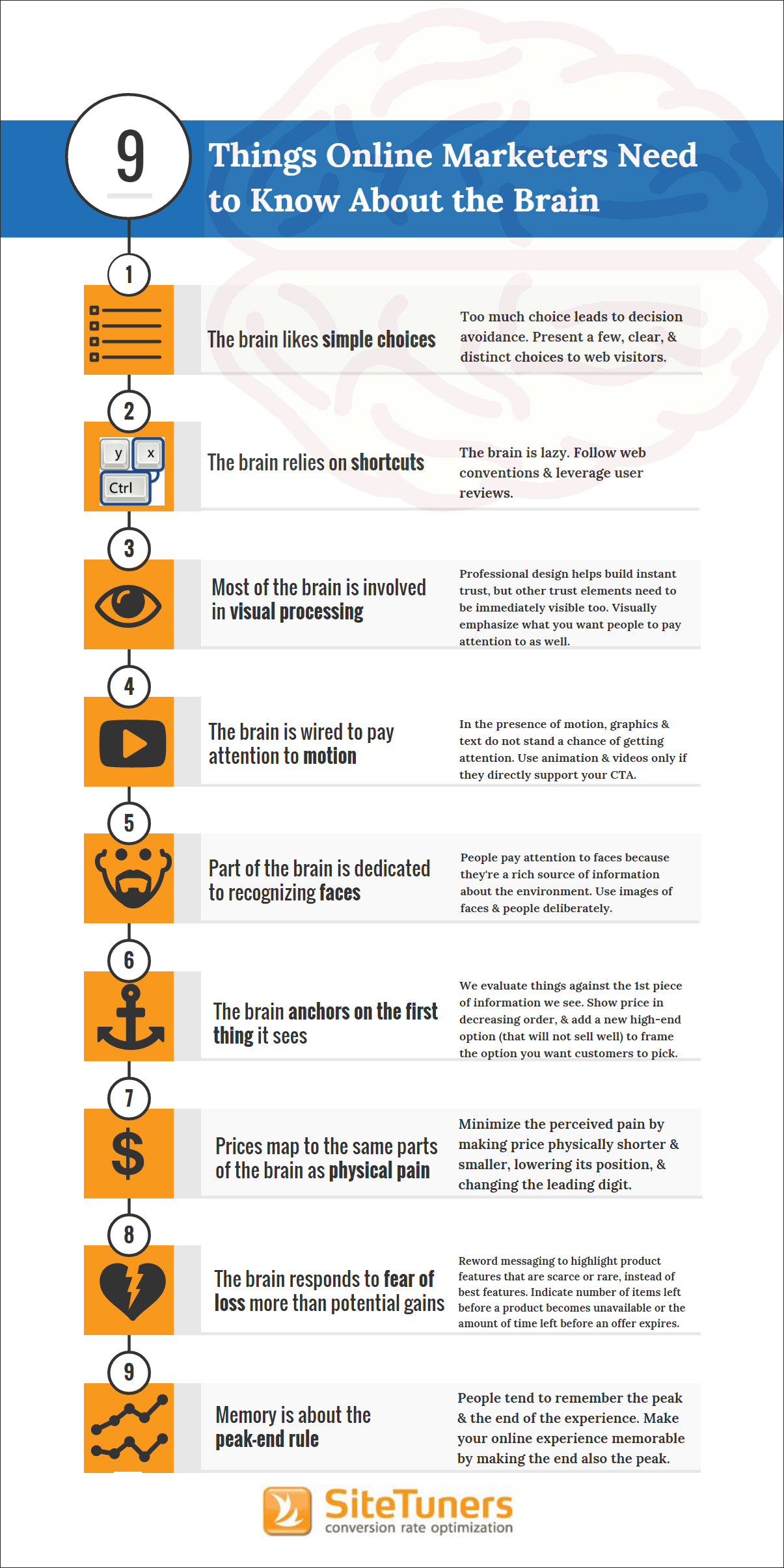
Here’s a great infographic from SiteTuners describing the most important cognitive biases and automatic brain responses:

So to get your visitors and prospects to act, follow the cues of the irrational brain when designing your online experience. Here’s how you can make decision-making as simple and as effortless as possible for the brain on autopilot:
1. The brain likes simple choices
Don’t overwhelm users with too many choices. Presenting users with too many options often leads to decision paralysis, where they’d rather put off making the decision than have to decide on the spot with limited information.
On your website, limit choices and make them visually obvious. Use wizards to guide users and lead them to a choice or product that’s best suited to them.
2. The brain likes shortcuts
The brain tries as much as possible to conserve power by using mental shortcuts.
Web conventions, for instance, allow users to interact more efficiently with websites. When the interface is familiar, the brain isn’t slowed down by the need to first figure out how it works and where things can be found.
The same is true with social proof such as testimonials and user reviews: it helps the brain establish early on that your website can be trusted: “Hey, 200,000 users can’t be wrong!”
3. Most of the brain is involved in visual processing
More than half of the brain is devoted to visual information processing.
And it processes visuals quickly. In fact, it only takes 50 milliseconds or 1/20th of a second for humans to form an impression of things they see.
This means your users can judge your website appearance almost as fast as their eyes can take in information. So make sure your online assets – from website to email to social media – are designed in a professional and modern way.
4. The brain is wired to pay attention to motion
One of the brain’s oldest survival instinct is motion detection. We are hardwired to notice when something is moving. This means that anything that moves on a web page (eg. videos and animation) not only catches, but monopolizes our attention.
While motion is not necessarily a bad thing, you should use it only when it supports landing page goals and contributes to users’ increased understanding of your offer. Otherwise, any video, animated text or moving pictures will only become unwanted distractions for your visitors.
5. There’s a part of the brain dedicated solely to recognizing faces and people
People are programmed to be social. We look at faces to learn more about the environment as well as to get behavioral cues from others.
You can benefit from this by using images of faces and people carefully on your landing pages. If you want your visitors to interact with certain elements such as the call-to-action, for instance, use an image of someone looking at it rather than gazing directly at the user.
6. The brain anchors on the first thing it sees
Anchoring is a shortcut used by the brain in decision-making. It refers to our tendency to use the first information we get as a reference point for evaluating everything that come afterwards.
Imagine you’re shopping for a laptop. The first one you see costs $3000. Then you see another that’s priced at $1800. Later you come across a $500 laptop. You’ll probably buy the second laptop at $1200 since you’ll think $3000 is too much for a laptop but $500 is too low to be of great quality.
Here’s how you can use anchoring on your site: Start with an expensive option that will serve as a reference point for your visitors and then list the others in decreasing order.
7. Prices map to the same parts of the brain as physical pain
People equate spending money with losing resources. Prices – which signify spending – activate the same region of the brain responsible for feelings of physical pain.
What hurts the wallet can physically hurt your users, too, so avoid symbols that represent spending. If you have an ecommerce website, minimize perceived pain by making prices appear shorter and smaller. Conversion Conference chair Tim Ash also suggest dropping the currency symbol altogether, as well as experimenting with various positioning and framing to reduce the “pricey” appearance.
8. The brain responds to fear of loss more than potential gains
For humans, the prospect of losing something is a stronger motivational force than the expectation of any gain. This is useful when you want to create a sense of urgency in your visitors. For instance, you can tap into their fear of missing out on your ecommerce product pages by highlighting the scarcity of certain items. You can also utilize this fear of loss through limited-time discounts and similar offers.
9. Memory is about the peak-end rule
As marketers, we want to turn our visitors into avid customers of our site or app. In order for visitors to come back and do business with us, they’d have to have a positive memory of their previous transaction. Fortunately for us, the brain has a Peak-End Rule, wherein the most memorable parts of an experience are usually its most intense point and at its end.
What this means is that your visitors aren’t likely to remember the entirety of their site visit, but they would definitely remember the parts where they either got frustrated or delighted. They’d also remember if their visit ended well or in tears.
It therefore pays to make sure your site is free from serious usability issues. If you’re in ecommerce, make searching for specific items as effortless as possible. Test your site thoroughly for errors and ensure that everything is smooth-sailing for customers all the way to the checkout process. If you’re in B2B, remove unnecessary clutter and distractions on your site that block customers from their path to conversion.
When you really think about it, digital marketing boils down to one thing: persuading and influencing the brain. But your design and messages should be targeted to the right side of the brain. If you want to design an invisible, effortless experience, then design for the illogical, subconscious aspect of the mind that’s responsible for memories and automatic decisions.
Understand the inherent workings of the brain – its fondness for shortcuts to simplify decision-making so you can stop designing websites that are too complicated for the brain to process.
Conversion Conference is evolving into Digital Growth Unleashed! After dozens of shows in the US and Europe since 2010, we are defining a new and more powerful perspective for digital persuasion. Create the most compelling end-to-end customer experiences. Attract, persuade, serve, and the technology to make it happen – we’ve got you covered with four parallel breakout tracks! Plan early and get the absolute lowest rates possible for May 16-17, 2018 at the Mandalay Bay Casino & Resort, Las Vegas.

 717 798 3495


2 thoughts on “9 Ways to Design Your Website According to How the Brain Works”