I know you. You get tunnel vision when working on your website: you know each and every page intimately because you’ve approved every image, headline, and all the body copy. You’ve wrestled with how to display the call to action. So it’s impossible to be objective about your own website.
That’s true even if your job is to find and fix conversion problems on other people’s sites, like mine is. Sure, I can increase conversions on someone else’s site any day of the week. But a recent project for my own business was a different story.
We’re rebranding from Click Advisors to Conversion Max because we narrowed our services and added new team members – which requires a brand new website.
You might think a conversion specialist knows all the tricks for building a high-converting website, but those tricks are really just best practices. And best practices are only the starting point, as Chris Goward of Widerfunnel explains in his new book: You Should Test That. You have to do a lot of testing beyond the best practices to get a kick-ass site.
Here’s the process this conversion specialist is following for launching a new site:
Step 1: Defined My Target Audience
The very first step for creating a high-converting website is to gain a thorough understanding of who you need to appeal to. Understand their problems, their frustrations, and what they’re hoping to accomplish on your site.
Repel anyone who doesn’t fit that mold.

In the early days of web, businesses wanted as much traffic to their sites as they could get. That’s hogwash. That won’t lead to more sales; it’ll just give you a bigger hosting bill. What you want instead, is to attract theright people. Not only that, but you want to convert the right people. Don’t waste your – or your salespeople’s – time talking to leads that aren’t your target market.
In order to attract and convert the right visitors to your site, however, you have to define who’s right and who’s not. In our case, we only work with businesses that are already spending $20k – $100k/month on AdWords.
So that’s criteria #1.
But that’s still too broad.
So I created three personas, to help my web team understand the types of people who need PPC Management and Landing Page Optimization with that spend. Here’s my step-by-step process for creating personas.
Step 2: Build a Wireframe, Get User Feedback
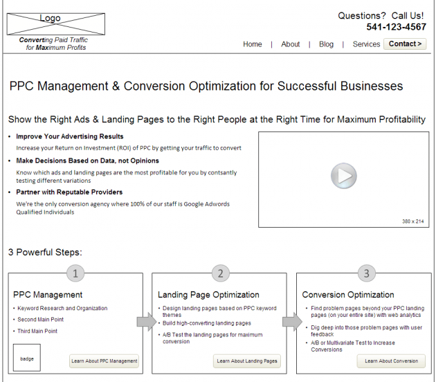
You’d never build a house without a blueprint, would you? Yet that’s exactly what so many people do, when they build a website without wireframing it first. A black-and-white wireframe allows you to focus on the site’s layout and the visitors’ experience as they flow from page to page, without getting distracted by the aesthetics.

Here are some tools for building wireframes:
- Justinmind (this is what I used for this site)
- Balsamiq
- Mockingbird
- Mockflow
Now here’s where the real power of wireframing comes in: run a user test on your wireframe. Make sure it’s interactive, so testers can click from page to page, just as they would on a real site. Seeing where they get confused or frustrated or fall out of the funnel at this point can save you thousands of dollars of designer/developer time, rather than fixing it after the site has been built.
From running user tests on my wireframe, I learned that all the copywriting that we were so proud of because of its beautiful benefit statements, was actually cluttering the page.
So we cut the text by 50%.
Then we cut it by another 50%.
Until we were left with only the most essential messages.
Get Conversion Optimization Tips from the Experts!
Attend Conversion Conference – 40 sessions focused on the latest strategies and proven tactics by the world’s highest converting websites.
Step 3: Run Attention Maps and 5-Second Tests on the PSD
Once you’ve refined the wireframe based on user feedback, it’s time to hire a designer to make it look pretty. But design is subjective, so here’s how to avoid making design decisions based on your own biases:
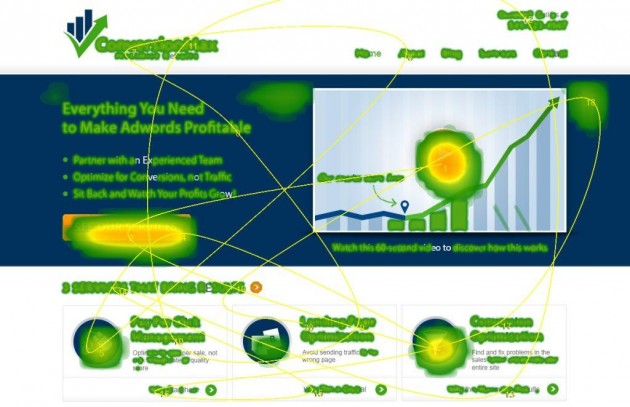
Use Attention Wizard to see which elements on the page get the most attention.

Heat maps clearly show what page elements are grabbing attention.
You can see that our video play button gets the most attention, followed by our “See Our Services” button – which is exactly what we want (once our video is done, ahem).
Run a five second test, and ask random, anonymous people questions about your design. You’re not surveying your target market, but it’s a fast, affordable way to gauge whether people understand what your site is about.
Step 4: Build the Site, Get User Feedback
Once you’ve refined the design based on the feedback you gathered, you’re ready to build the site. But just because you’ve gathered feedback on the layout and design already, doesn’t mean you found all the areas that could confuse or frustrate your site’s visitors. So continue running user tests.
From running the second round of user tests, I learned that we need to add more case studies and documentation of results. Which are on the way!
Next Steps
Following this process, I avoided some mistakes and found ways to improve my site at every step of its development. But this doesn’t mean my site is perfect.
My next steps are to:
- Finish the site, of course
- Use Google Analytics to find problematic pages
- Run user tests every month to figure out why those pages are problematic
- Use data from analytics and the user tests to come up with ideas for my A/B tests
And that’s how a conversion specialist builds a new site.

This article first appeared on the UserTesting Blog republished with permission from the author.
About the Author
 Theresa Baiocco is Conversion Strategist at Conversion Max, where she specializes in helping mid-sized businesses increase their online revenues with conversion optimization. She has a Master’s Degree in Marketing from the University of Colorado in Denver, a Master Certification in Conversion Optimization from Market Motive, and is a Google AdWords Qualified Individual.
Theresa contributes guest blog posts to several popular conversion and PPC blogs, such as Unbounce, UserTesting, and 3Q Digital, among others. Her writing has also been included in the Wall Street Journal and is often included in Marketing Day. She’s a dog-lover, a new mom, and a former travel-junkie.

 717 798 3495


