
Your site’s visitors have ADHD. If they don’t like what they see within 1/20th of a second, they’ll hit the back button and go to your competitor’s site.
So before you obsess over all the conversion principles for your landing pages, the first job your pages need to do is simply prevent people from hitting the back button. Once the page has convinced them to stick around, its next job is to get them to convert.
How do you convince them not to leave?
Make these three elements glaringly obvious above the fold:
- What you do
- Why they should choose you
- What they should do next (the CTA)
This seems unmistakable to us on our own sites. But we know our sites so well that it’s impossible to view them the way first time visitors do.
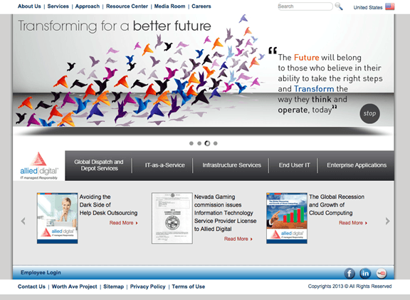
Consider the page below. I’m sure this company feels that it explains the What, the Why, and the CTA just fine.
But as a first-time viewer, do YOU?
So how do you look at your own site with fresh eyes?
One of my favorite tools for analyzing a site’s What, Why, and CTA is fivesecondtest.com. And starting at only $20 for 100 responses, valuable feedback is affordable for any budget.
How FiveSecondTest.com Works:
First, you upload a screenshot of your homepage, landing page, or whichever page you’re analyzing. Make sure you consult Google Analytics and take a screenshot of the most popular screen size of YOUR site’s visitors.
Random, anonymous people will see the screenshot for 5 seconds, then it disappears and they answer up to 5 questions that you’ve written out for them. You’ll see a word cloud of their responses, as well as raw results. They’re written responses, not multiple choice, so they’re not biased. What you’ll want to do is download a csv file, though, so you can find patterns in their answers and graph them.
Fivesecondtest.com gives you the option to give instructions to the respondents before they see the screenshot, such as “Imagine you’re looking for a keyword research tool”.
Do not do this!
You don’t want to give them information that they’ll merely regurgitate back to you. You’re trying to figure out whether they understand what you do in the first 5 seconds. Don’t tell them the answer before they’ve even seen your page.
You also have the option to use their respondents or choose your own. This is one limitation with the tool: I’d like to have the ability to define the target market. If I choose my own respondents, they’ve likely already heard about me (or my client), so I won’t get an accurate picture of how well the site performs on the What. For this reason, I use Five Second Test’s respondents, but crosscheck my findings for the target market, which I’ll explain later.
Fivesecondtest.com provides you with suggestions of questions to ask. I like to ask the following questions in this order:
First, I want to see whether people understand what product or service the company sells, so I start off with some variation of this question:
- What does this company sell? or
- What services does this company provide?
Next, I want to find out which elements stand out the most, in order to dig a little deeper on why they answered the way they did on the first question. So my second question is: “What do you remember most about this page?”
After that, I want to see whether the page instills trust. This is an important part of the “Why”. So the 3rd question I ask is: “Does this company (or brand) seem trustworthy? Why or why not?”
The next question tells me whether the CTA is obvious enough: “Where would you click next?”
The last question asks for general opinions: “How can we improve this page?”
Case Study: Spyfu.com
Here’s how I recently used fivesecondtest.com to assess Spyfu.com’s What, Why, and CTA as part of a conversion audit to come up with hypotheses to test. You’ve likely heard of Spyfu, but if not, they provide historical information on your competitors’ keywords, ads, and rankings, as well as contact information for gathering sales leads.
By the way, they’ll be in Vegas during Conversion Conference, as sponsors of the Content Marketing Conference. I hear they’re launching a brand new Spyfu, so plan to talk to them about it (I don’t get paid to endorse them; I’m just a huge fan of their tools and their team).
They’re super smart people in Arizona with plenty of traffic to their site, and they’re constantly running A/B and MVT tests to improve their conversion rates. They knew their homepage was the page with the biggest opportunity for a conversion lift, but they needed a fresh perspective for tests to run on it. So they hired me to do a conversion audit and wireframe a new variation for their homepage.
Here’s what their original homepage looked like above the fold:
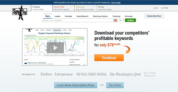
Here are the results of the Five Second Test with 104 respondents:
Question: What does this company sell?
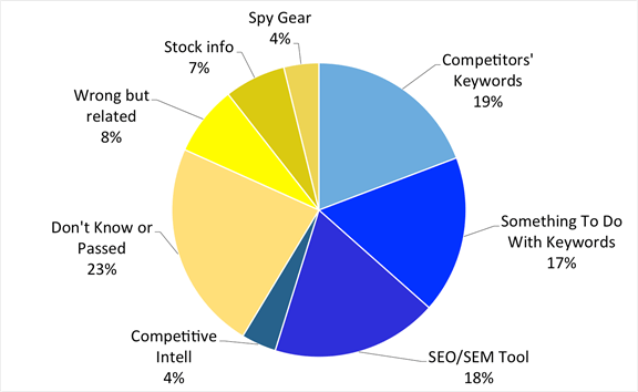
The shades of blue reflect answers that were right, or at least in the ballpark, and make up 54% of the pie, with 19% of the respondents completely nailing it by answering “Competitors’ Keywords”.
The shades of yellow, which are the remaining 46% of respondents, didn’t correctly understand what Spyfu does, after looking at the homepage for 5 seconds. Notice that 7% of the respondents thought they offered something to do with stocks (because of the picture on the video), and 4% thought they sold spy gear!
Right off the bat, this gives us some hypotheses to test.
Question: Does this company seem trustworthy? Why or Why Not?
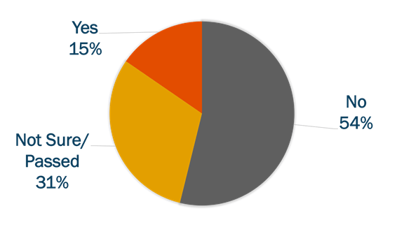
Ouch! Only 15% of the respondents thought the company was trustworthy based on the homepage.
These were the reasons they gave for their answers:
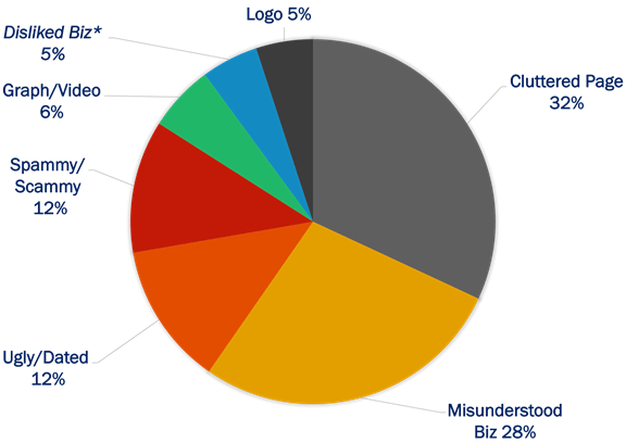
*The 5% that didn’t like the idea of gathering competitive intelligence (?!) is not their target market so they shouldn’t try to please them.
These responses give us more ideas to form our testing hypotheses such as decluttering the page, clarifying the What, updating the design, etc.
This also gives us topics to talk about when we interview their target market. For example, when I interviewed SEO and SEM marketers, I drilled down on why some of them thought Spyfu seemed spammy or scammy to figure out how to overcome that perception.
Question: Where would you click next?
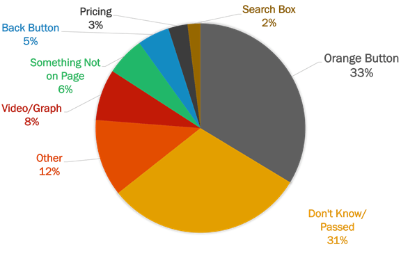
A third of the respondents said they’d click on the big orange button, and almost as many responded that they didn’t know, or they didn’t answer.
The answers to this question can be tricky when forming your hypothesis. Although the big orange button is certainly very obvious on the page, not everyone will click on it. For example, humanistic buyer types will probably always go the About Us page first, whereas methodical buyer types will look for a link explaining how the process works.
So just because you don’t get as many people as you’d like answering with your primary CTA, it’s not necessarily a bad thing.
For further insight, I compared these responses to a heatmap from Visual Website Optimizer, which shows where Spyfu’s visitors actually click, and it showed a very different story: most people are either logging in to their account or conducting competitive research using the free toolbar, which are both valuable activities for Spyfu.

It’s not uncommon to get very different answers when you ask people what they would do, and then compare it to what they’re actually doing. This is why it’s imperative to use a variety of data points to form your hypotheses.
About the Author
 Theresa Baiocco is Conversion Strategist at Conversion Max, where she specializes in helping mid-sized businesses increase their online revenues with conversion optimization. She has a Master’s Degree in Marketing from the University of Colorado in Denver, a Master Certification in Conversion Optimization from Market Motive, and is a Google AdWords Qualified Individual.
Theresa contributes guest blog posts to several popular conversion and PPC blogs, such as Unbounce, UserTesting, and 3Q Digital, among others. Her writing has also been included in the Wall Street Journal and is often included in Marketing Day. She’s a dog-lover, a new mom, and a former travel-junkie.

 717 798 3495


