How many times have you walked back and forth across the grocery store in search of that one item that you can’t seem to find? How many times have you asked for help, or worse, left without finding it? Now think about your web visitor. What if they are looking for an item that they can’t find? You might be surprised to know that over the last decade of conducting site intercept studies on e-commerce websites, we have found that the top reason for site visit failure is that visitors were unable to find what they were looking for. Our research indicates that over 50% of failed online visits revolve around “findability”. While we all know that conversion is important, so is making sure visitors can find the product, otherwise what good is an optimized checkout process.
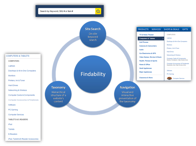
In our efforts to better understand the “why” behind poor findability, we identified three major influencers: Site Search, Taxonomy, and Navigation.
Taxonomy
Defining
Let’s start by defining “taxonomy”. In the context of a website, we define taxonomy as the representation of the hierarchical structure of a website’s content. Other terms often used include “structure”, “hierarchy”, and “tree”. When talking about taxonomy within your organization it is important to make sure everyone is on the same page because definitions vary.
Determining the Cause
When evaluating a taxonomy, your primary focus should be on the category labels and parent, child and sibling structure. To best understand if your taxonomy is driving poor findability for site visitors, we recommend two different research approaches: Card Sorting and Tree Testing.
Card Sorting is an effective method for finding out how people think your products should be organized, and is typically used when the goal is to create a new taxonomy. Card Sorting is a process where participants are asked to arrange products (cards) from your website into groups that make sense to them. The illustration below is using OptimalSort by Optimal Workshop.
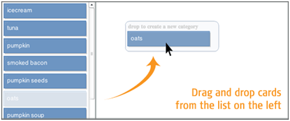
In an open card sort, participants are asked to name each group. While in a closed card sort, participants are asked to arrange products into pre-defined groups. When doing a card sort, it’s best to target a session of no more than 15 minutes which typically allows the participant to sort 50-75 cards. Cards should include a balanced representation of your entire product assortment. For larger assortments, subsequent card sorts may be required. At least 40 completed sessions is recommended.
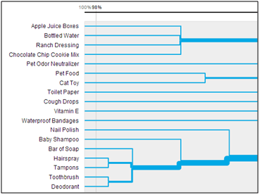
The results showcase how participants grouped the products and then what they named each group.
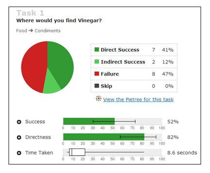
Another approach called Tree Testing is an effective method for evaluating the findability, labeling, and organization of an existing or newly proposed taxonomy. Tree Testing is a process where participants are asked to identify the location of product within a simplified text version of your site structure (the tree). The illustration below is using Treejack by Optimal Workshop.

This ensures that the structure is evaluated in isolation, nullifying the effects of navigational aids, visual design, and other factors. Each task starts with “Where would you find [product]?” and ends once they select either a category or “skip this task”. When doing a tree test, it’s best to target a session of no more than 15 minutes which typically allows the participant to complete 15-20 tasks. A goal of at least 100 completes per task is recommended.
Tree Testing is a simple and effective method for validating whether a proposed taxonomy will make it easier for visitors to find what they are looking for. It can also be used to help you identify problem areas within an existing taxonomy.
The results allow you to quickly pinpoint problem areas within your taxonomy.
Navigation
Defining
We define a website’s navigation as the visual and interactive presentation of a site’s taxonomy. This ranges from simple fly-out navigation to the ability to filter products based on attributes such as brand, price, size, color, etc.
Determining the Cause
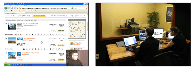
Because of the interactive nature of a navigational experience, a lab-based Usability Test is generally the best approach for uncovering whether poor findability is caused by your site’s navigation. In a usability test, people who are representative of the target audience are given realistic tasks to perform with the website; what they do and what they say are observed by a research team. When repeated issues occur, these are identified as usability “findings”. A review of these findings will help you understand whether navigation is a source of concern for visitors. A standard usability study consists of eight 90 minute one-on-one sessions conducted in a specially designed usability lab.
Site Search
Defining
Site search is the on-site keyword search feature typically located at the top of a web page. With the introduction of predictive search (auto-complete), keyword search plays a prominent role in helping visitors locate their desired product.
Determining the Cause
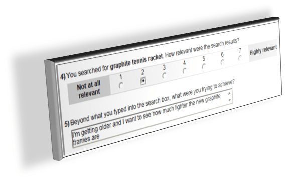
So how do you know if your site search is the cause of your findability issue? The most efficient way to assess your site search is through direct visitor feedback using a behaviorally triggered survey. Utilizing a sophisticated, behaviorally equipped platform, like Qualtrics Site Intercept, will allow you to survey only visitors who use the search feature as well as capture additional information such as search term(s) used, links clicked on, position of links within search results, # of items purchased, order value, etc. The purchase related information will help you quantify the impact of a poor search experience on the bottom line. The illustration below gives you an idea of the types of questions that can be asked of your searchers.
Summary
With over 50% of failed online visits revolving around “findability”, it’s imperative that you take a hard look at what is causing this negative experience. Hopefully the research approaches I’ve shared will help your organization take a positive step towards improving the findability on your site and ultimately increase conversion.
This post originally appeared on Usability Sciences’ Usability Blog, republished with permission from the author.
Ready for More Conversion-Boosting Tips?
Join the worldwide community of conversion optimizers at ConvCon 2017!
About the Author
 Scott Gunter, Chief Operating Officer of Usability Sciences, is a senior-level usability professional with a 15 year track record of successfully leading and conducting user experience research using an extensive array of methodologies. Scott has successfully completed more than 300 research projects on behalf of companies like J.C. Penney, Kohl’s, Office Depot, and Dollar Tree. In addition to conducting research, Scott also writes articles for various publications in user experience including Usability.com, has presented at multiple conferences on the topic of user experience and research techniques, and also creates and produces webinars at Usability Sciences.

 717 798 3495


