717 798 3495


One secret to compelling readers to act is…
Tell them to.
Tell your reader what to do next. Loudly and proudly.
I’m talking about the call-to-action, or CTA. You need one on every page.
So if you want to increase your conversion rate, comb through your website, find the pages that lack strong CTAs, and fix ‘em.
Here are your best practices for click buttons
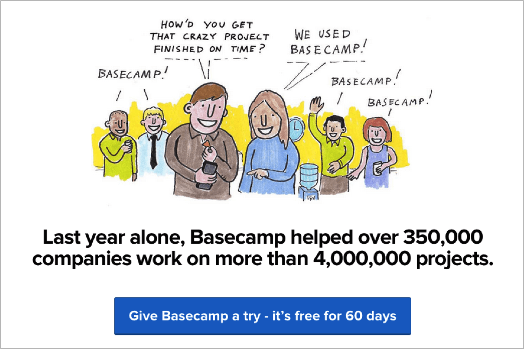
Your call to action doesn’t have to be a button. Sometimes they take the form of ad-like graphics. They’re often simple hyperlinks. But there’s no doubt, the obvious winning form is a button, which might instruct your reader to add a product to a shopping cart, sign up for a trial, download content, etc. (More ways to make your CTAs pay to come.)
Kudos, thanks and respect to WordStream and blogger Megan Marrs, who loaded 17 Best Practices for Crazy-Effective Call-To-Action Buttons with conversion-increasing gold. Here are several of the tips from the post:
- Use action words that suggest value. Use words such as “get,” “reserve,” and “take” instead of “submit,” “click here,” and predictably generic commands. (A list of power words for writing an effective call-to-action follows.)
- Create contrast. Don’t go for pretty. Make your buttons standout with contrasting colors that can’t be missed.
- Try different shapes and sizes. CTA buttons are worth testing. Experiment with designs. Winners are likely to be somewhat large, but you may find overly heavy-handed designs work against you.
- Try different lengths too. Megan says to keep your button copy to two to five words, but she also shares this one, which looks like a winner to me.
Here’s another…
8 words and 2 symbols: too long? Doesn’t bother me because the offer sounds great.
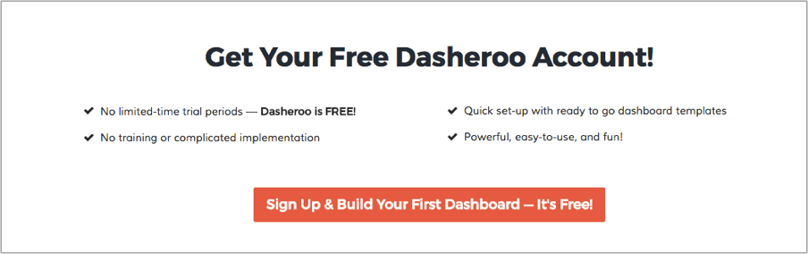
- First person may work best. It sounds a bit strange and less than obvious to switch your command-style CTA to the reader’s first person voice… “Give me…” “Reserve my…” In many cases, this tactic has proven to work best.
- Urgency works. Heard of FOMO? That is, “fear of missing out.” Tactics suggesting limited time offers, deadlines or even just the inclusion of words like “now” or “today” tend to convert.
- If your offer is free, say so. For obvious reasons, “FREE” always pulls well.
- Use directional cues. Arrows or graphics leading the eye to your CTA button can increase click-throughs. Keep ‘em simple and obvious.
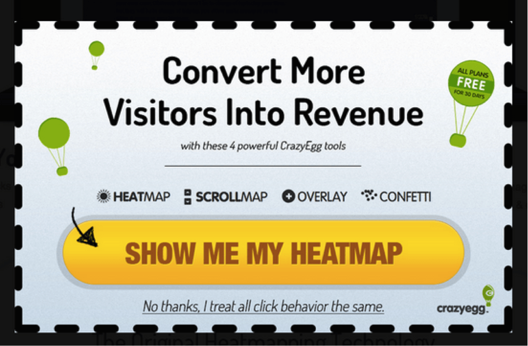 It’s just a little hand-drawn arrow, but it does help move your eye, eh?
- Add a line of detail. Consider adding an extra line of information within—or under—your button text, secondary to the main CTA. You might embellish your free trial button with “No credit card required” or something meaningful to encourage clicks. Megan suggests additions such as:
- Testimonials
- Key benefits (such as suggesting ease)
- Data points (e.g. users see a 40% increase in shares when using X)
See that? No credit card, no software required. It makes the free trial that much more compelling.
- Limit the choices. When faced with a myriad of choices, readers are likely to choose none. A simple, singular call to action generally produces better conversion results. If you must include multiple choices, give visual weight to the preferred option.
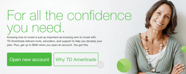 Notice how TD Ameritrade has two buttons, but clearly emphasizes the first.
- Consider the flow of the user experience. Assuming your content is presented in a traditional left-to-right, top-down manner, place CTAs towards the bottom or to the right of content. Avoid asking users to backtrack in order to click a button.
- Give it space. Your CTA buttons should be surrounded by a generous amount of white (or negative) space to make it stand out on the page.
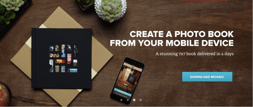
This CTA button from Mixbook is surrounded by space, which helps make it attractive.
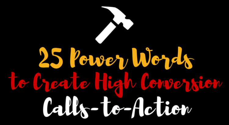
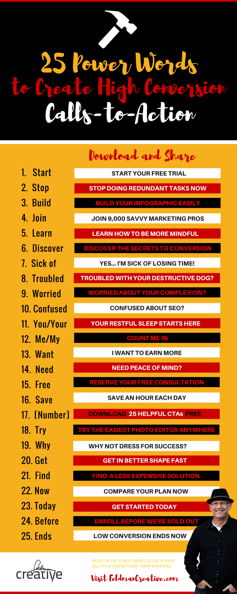
25 power words to make your call-to-action convert1
You’ll love this section. (And at the end of the post I offer you a cheat sheet you’ll want to download and save.)

The pop-up above employs many of the best practices described above. Note the action-oriented, value-packed headline. Note the contrasting color choice for the button, and the first-person voice of the highly engaging choice of words, “Build My Page.”
The call-to-action example above comes from Wishpond, as does the following list of ideas, The 25 Best Words to Use in Your Call-To-Action Buttons, by Samantha Mykyte. Samantha writes:
“Your call-to-action needs to be an instruction to the audience to provoke an immediate response. Make your CTA as clear as possible to ensure visitors are clear about their next action.”
Here’s Samantha’s excellent list…
- Start—Gets the user excited that they won’t have to wait to start enjoying the product or service.
- Stop—Reveal how a reader can prevent something they don’t want to happen and succeed.
- Build (or Grow)—Help the visitor create something and accomplish their goals. “Grow your email list today” or “Build a community of followers.”
- Join—Make someone feel like they’re becoming a part of something.
- Learn—Appeal to the reader’s quest for knowledge. Be more specific than “learn more.” Indicate what they’ll learn.
- Discover—Tell a visitor what they’ll find out.
You can go the negative route with your call-to-action and play on a visitor’s fears and frustration.
- Sick of—“Sick of losing out on profits?”
- Troubled—“Troubled with your payments?”
- Worried—“Worried about your conversion rate?”
- Confused—“Confused about Facebook contests?”
Get More Tips for Calls-to-Action That Convert!
Get proven conversion-boosting strategies at Conversion Conference.
Make your call-to-action personal…
- You/Your—Make a visitor understand you care and will do something for them by writing “you” or “your.”
- Me/My—Give the visitor the feeling of possession. (This is the first person trick discussed earlier). “Get my free ebook now!”
Communicate value…
- Want—Convey desire. “Want to get the highest conversion rates?”
- Need—A need is a want made more urgent. “Need more out of your investments now?”
- Free—A very attractive price point. ‘Nuff said.
- Save—“Save time…” “Start saving…” In B2B, your value prop is bound to be about time and money.
- [Insert number here]—Use numbers. Make them specific. And valid.
- Try—No commitment needed? Sounds irresistible.
Add a compelling reason to act…
- Why—“Why” is followed by the reason, cause or purpose (and usually, question mark). It helps the visitor make up their mind about the question.
- Get—“Get” works good. People get it. “Get the best coverage on your network.”
- Find—Heighten the urge to discover something and appeal to the reader’s curiosity. “Find out how to increase conversions.”
Convey urgency…
- Now—“Now” is like this funny little copywriting trick that everyone seems to agree increases conversion.
- Today—“Today” is a form of “now.” Tomorrow’s not happening in the CTA business.
- Before—Encourage your readers to get somethingbefore time runs out or before everyone beats them to it.
- Ends—“Sale ends at midnight.” Expirations and deadlines prompt action.
5 ways to make CTAs pay
The following ideas come courtesy of the HubSpot Academy, which features an in-depth lesson on creating and using CTAs. The user guide offers far more than I’ve included here, so check it out for more information.
I should also mention, HubSpot is an all-in-one platform that includes a tool for creating CTAs. That said, any app or service that enables you to output images will help you get the job done. I often use Canva to design mine.
Generate leads
Attract visitors and turn them into leads by placing CTAs on your web pages that attract new visitors, such as your blog. The best places you could put a CTA are at the end of a post, in the sidebar, and as a floating banner in the corner.
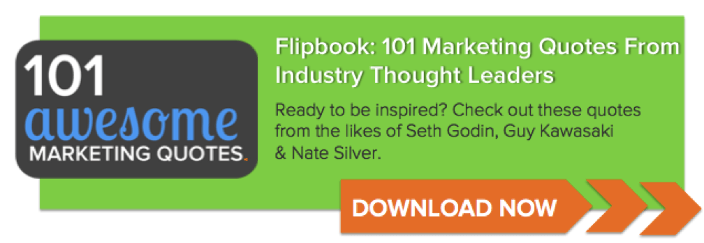 This is an example of CTAs HubSpot includes at the conclusion of their blog posts.
Social sharing
Social sharing CTAs are an effective way to draw visitors into your tribe. Place them on blog posts and landing pages.
Lead nurturing
Most brands have a sales cycle of sorts that precedes the sale. As such, it’s smart to make offers related to your product (product demo, free trial, free content, etc.). Place these CTAs in strategic spots where leads tend to visit making sure to attach them to highly relevant offers.
Close
Of course, a CTA can also prompt a potential customer to buy right then and there.
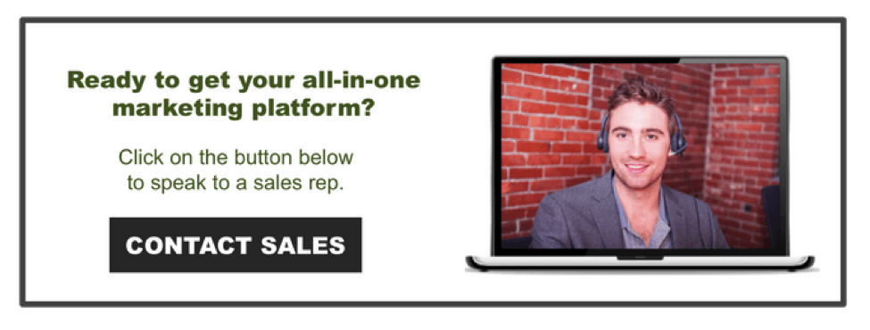 Here’s a sales-focused CTA, also from HubSpot.
It’s a bit shocking how rarely you find the “close” CTA on websites today.
Promote an event
Use an event promotion CTA to sell tickets for your event.
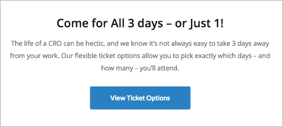
Here is a sample of how to promote an event with a CTA from the upcoming Conversion Conference where I’ll deliver a session on persuasive copywriting tactics.
Check out this ultra-easy push-button button builder
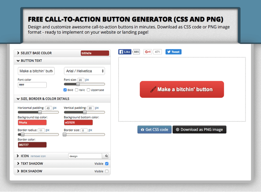
Rather not labor in a design program to create a cool CTA button? Apparently the web’s crawling with easy tools to knock ’em out. This post offers 18 of them.
I messed with several. Button Optimizer is the best I’ve found. Look at that simple little interface. I pushed a few buttons, slid this, typed that, menu’d around for a minute and as you see above, I made a bitchin’ button.
Go forth and convert
A quick review:
- Including relevant calls-to-action is the secret to increasing your conversion
- Experiment with proven best practices to perpetually improve your results
- Write powerful CTAs
- Download the complete list, your free cheat sheet below, “25 Power Words to Create High Conversion Calls-to-Action
This post originally appeared on Feldman Creative, re-published with permission from the author.
About the Author
 Barry Feldman is a content marketing consultant, copywriter and creative director with experience that predates AOL, Google and web-dot-anything. He’s been leading the creation of thousands of marketing programs for companies big and small for 25 years.
Barry blogs at many top online marketing websites and is a popular columnist. He’s often featured in interviews, webinars and industry best-of lists. Barry has been named a Top 40 Online Marketer by Online Marketing Institute, a Top 20 Content Marketing Leader by Onalytica and was included in LinkedIn’s Top 25 Social Media Marketers.